Artist Journal #1: Yin "Nosego" Goodwin
|
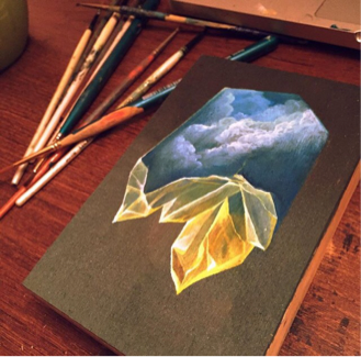
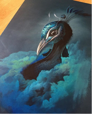
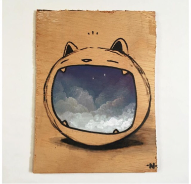
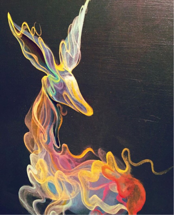
NoseGo is an artist that contains passion surrounding the illustration side of art, and media arts. Most of his work tends to contain some sort of "energetic" type of feeling. A lot of his work contains patterns colors that suit one another whether it's complementary colors, or just one color that contains different amounts of value throughout his work. He also creates a lot of work that involve animal, mostly dog looking, characters (a perfect example would be the image at the very bottom). On the four images that surround this paragraph, all of the images contain misty objects, or clouds which is something he does really, really well on his work.
During my research, I found that he doesn't have a portfolio where he describes each and every piece. Instead, I found out that he has most of his artwork posted on his Instagram "nosego". It's hard trying to figure out what he tries to get across through his artwork, but one thing you notice is that mostly every single one of his work contains an animal or an animal face. It makes me feel as if Yis connects his work with his imagination when it comes to his characters, or maybe things he seen as a child. Yis has tons and tons of artwork across his page that really catch my attention, whether it's the cloud like images that are on the work, or the way he blends and complements colors with one another. His imagination that reflects fantasy pieces of art really makes me get new ideas of how I can make other projects. Looking at his work makes me get ideas that I could use by using different type of paint, like watercolor. |
Artist Journal #1: Yin "Nosego" Goodwin
From looking off of NoseGo's work, I came across multiple pieces that really, really caught my attention. The two that caught my attention the most are the ones shown at the bottom. They both look quite simple but yet, in my opinion, amazing. I really like the way he mix/blended his colors on both of his pieces. The bottom-left photo, which seems to be some type of animal, is drawn out perfectly with shadow provided at the bottom to show its a 3D ball or form. Inside the mouth contains a sky-like image which makes the piece stands out a lot, considering the fact that the mouth is the only part from the whole piece that contains color. On the bottom-right photo, it shows an animal made out of, what seems to be, colored-like smog. Colors were used in a creative way and were mixed perfectly with one another. The way the colors were used in both pieces gave me an idea of how I should do a project of my own. After examining both pieces for a while, I had an idea come to my head that would connect both of these pieces into one of my own. For my idea, I plan on painting a negative and a positive space for an animal of my choosing. I would have to carefully choose my colors and try to get a good blend from what I am to choose. The idea may sound simple, but simple is sometimes perfect.
|
|
Artist Journal #2: : Alberto Seveso
Alberto Seveso is an Italian Illustrator and Digital Photographer. He is currently living in the United Kingdom as a "freelancer". Alberto started to grow love for graphic art ever since he was in his young ages. Now, Alberto has done artwork for many popular profiles such as Adobe, Disney, MTV, Nikon, Sony, and many more.
Looking at most, if not all, of Alberto's work I could see that they contain some sort of a "distortion" type of effect, similar to "manipulation". As shown by the examples above, you can clearly see that they all contain this smoke-like fade. I believe that he captures these effects through his own separate photography since he also professionalizes in high-speed photography. Throughout his work, he does a very excellent job cropping out his visuals and editing his photography. Another thing Alberto does excellent on is how he chooses his colors. Every single piece of work he has done contain colors that in some way complement each other.
Personally, when I take a look at Alberto's work I honestly see no meaning behind them. What I do see when looking at the pieces is some feeling that are behind the pieces. I feel like since most of his work is for his clients, he doesn't connect to it in his own way since it's something another person wants him to do. Instead, he attaches feelings among the pieces that are picked up upon the viewers. This feeling adds on onto the product the clients want from Alberto.
The reason why I chose to talk about this artist is because most of his work relates to what I want to start doing. Most of his work contains mainly a "dreamlike" feel to it, and that's something I try to focus on when I try to do projects over photoshop. When I look at his work, in my mind I compare them with my past projects. For future work I actually want to try to make my pieces similar to his, but in my own way. The number one thing that I love in his pieces is how he adds his distortion affects, I'm a really huge fan of that.
Artist Journal #3: MOWA
Describe: MOWA, whose real name is Matt Osborn, is an independent artist. He is a born and raised British Columbian artist. Most of his work is done by either painting or digitally. As shown above, I provided some of his work. Right off the bat, you might realize that the first three pieces would be considered somewhat of copyright, but they were just small projects he did on his own free time. I put them in the slideshow because I really wanted to talk more about of the way he mixes and chooses his colors. His colors are so simple, but yet, his pieces look amazing because of the way he mixes the colors. I believe, from looking at most of his work, that he doesn't mix each color individually to get the color he wants, but instead it looks like he just places a color of paint on top of one then slowly adding a color on top of it to either make it look brighter or darker.
Analysis: Based off of the research that I obtained about MOWA, it is said that he moved quite a bit mainly because of school and deciding what he wanted to do the rest of his life. I believe that because of him moving quite a bit, in some way it helped him discover new things which could possibly lead to new ideas when making art. It is said that he loves nature, so this could possible explain why most of his work relates to nature.
Reflect: Reflecting off his work would somewhat be similar to what I talked about in my analysis section. I believe that because of him traveling quite a bit, he was slowly but surely gathering ideas. Mostly every piece he has made contains some sort of animal but painted differently. Some of his pieces contain some image of scenery while others are just painted with the same colors, just with a different animal.
Connect: By looking at MOWA's work, then looking back at mine, I could see a similarity. Even though MOWA focuses his work involving nature, he also provides a feel of fantasy because of the way he uses his colors. A while back for my Advanced Visual Studies class I had made a painting with watercolor of a California grizzly bear (could be found under my portfolio page). Turns out, MOWA also has a piece of art that is very, very similar to mine expect with a different type of scenery that he painted. When I found this I was very surprised because it made me realize that it's actually really, really hard to try to come up with original art work. This makes me want to try to somewhat take my level of creativeness even further because I would like to know that the work I make is not, to my knowledge, common. Hopefully by looking at the way MOWA uses his colors, I can come up with ideas that would represent that.
Artist Journal #4: Muhammed Salah
Describe: From looking at the work of Muhammed, you can tell right away that most of his work is based off of his lines. Most of his lines are bold, hard-edged, or perfectly curved. Another thing he does that make his pieces come out the most is the way he uses his colors. Most of his colors look life colors you would picture in a galaxy. These colors add on the feeling of fantasy across his pieces.
Analysis: There wasn't really enough research to pick up on Muhammed. The only think I could find was that he was labeled as a caricature artist, illustrator, and as a digital designer. It's a bit hard trying to say what his pieces might mean to him, but it might be the simple fact that he just loves making a variety of pieces, could be anything, as long as his colors fit in nicely into his ideas. I'm guessing he's currently working as a freelance artist.
Reflect: Like I said in the section of analysis, it's hard to say how Muhammed's pieces reflect on himself since their is literally no information to find about his life. Once again, he makes the pieces he makes because he loves how a variety of pieces, with the touch of galaxy-like colors, could turn out phenomenal.
Connect: The reason I chose this artist is because Muhammed pieces, in my opinion, are just fascinating to look at because they're pretty simple but the help of his colors just make them way better. His pieces are similar to the goal I wish I could do on illustrator, maybe one day. HIs pieces are pretty similar to mine because of the way I choose my colors my well. Hopefully by looking at more of his pieces I can get a better idea of what I would want to do on my next project.
Artist Journal #5: Tim Tadder
Describe: Tim Tadder is is a visual communicator who produces award-winning campaign work for top consumer brands. Even though his work is pretty much for ads, it seems as if all of his photos that contain a model contain either a double exposure or a explanation of how the photo connects to them. For the first photo there is Kyle Beckerman, an american soccer player, which contains a double exposure of aa beach that has, what seems to be, soccer posts. This obviously reflects soccer since that's what he does for a living. Same concept goes for the second one, instead it's about swimming. The last one does not contain a double exposure but he does an excellent job getting the feeling across from effects.
Analysis: This artist doesn't really have any intentions when doing work considering the fact that he makes work for top consumer brands. It's all up to the brand to tell him what they want from him. Although, for most of his work, he tries to take highly stylized action shots which draws viewers into the moment. Tadder has always been active in sports, exploration, and adventure. He believes that takes live action shots help recreate the loo for advertising shoots.
Reflect: There are no really deep meanings behind most of his pieces, but only some type of feeling. In this case it's mainly the feeling of action.
Connect: As of now, I have only made an edit that contained action. This edit was for a photo of one of my friends. From looking at most of Tim's photographs, I gained an idea to try to take photographs that, in some way, connect to the person of who I am taking the photo of. Editing these future photos with double exposure will help greatly because I will be able to add more connection to it. To sum it all up, my goal for this project is to try to create pictures with a deep connection of whoever the model may be.
