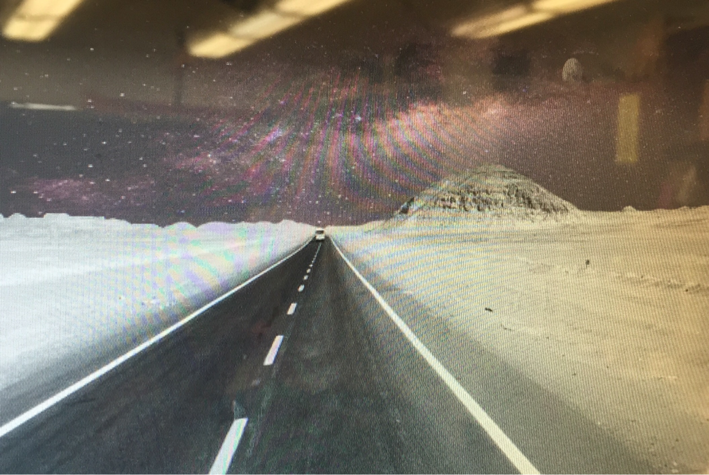
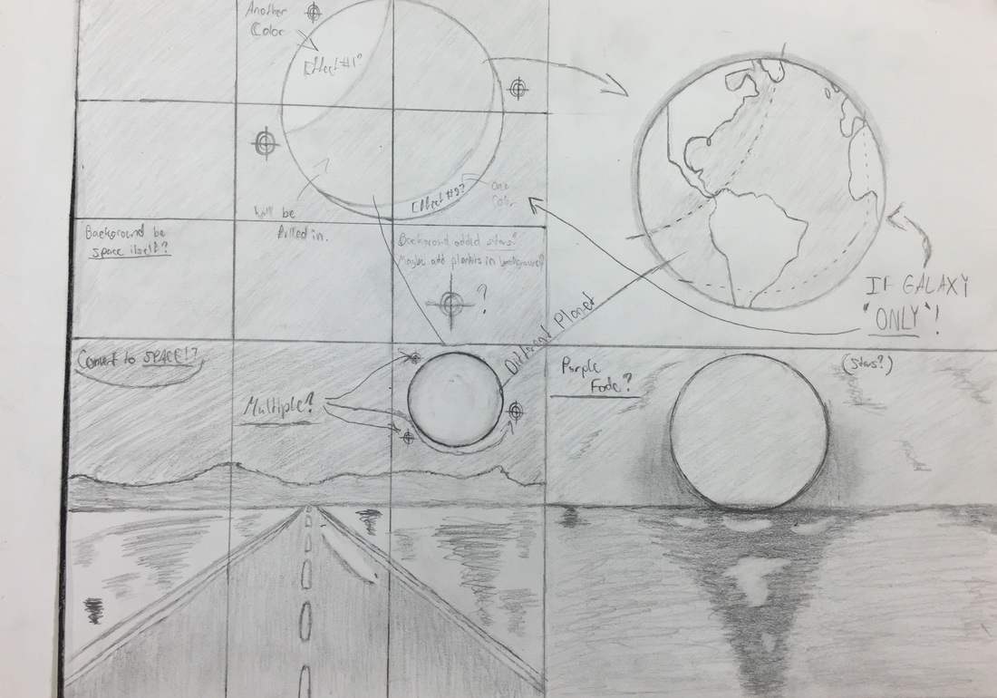
In the beginning, I first started out by drawing a planet and the outline of the effects I would do on the image to the right.
(I decided during this part that each effect would have there own color and I was thinking if I wanted to add more stars.) 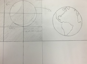
(J. #1) Project #1: Sketches (Part 3)On the third sketch I sketched out a background/view point that I could start from just incase I wanted to change my piece if I wanted to do this.
(I decided that if i was to follow up on this background/ view point, the planet would have to be different than planet Earth. I was also thinking if the background's sky should be made into space, it might sound weird but I might be able to make it look good. I also drew out some more stars just incase I wanted to add some). 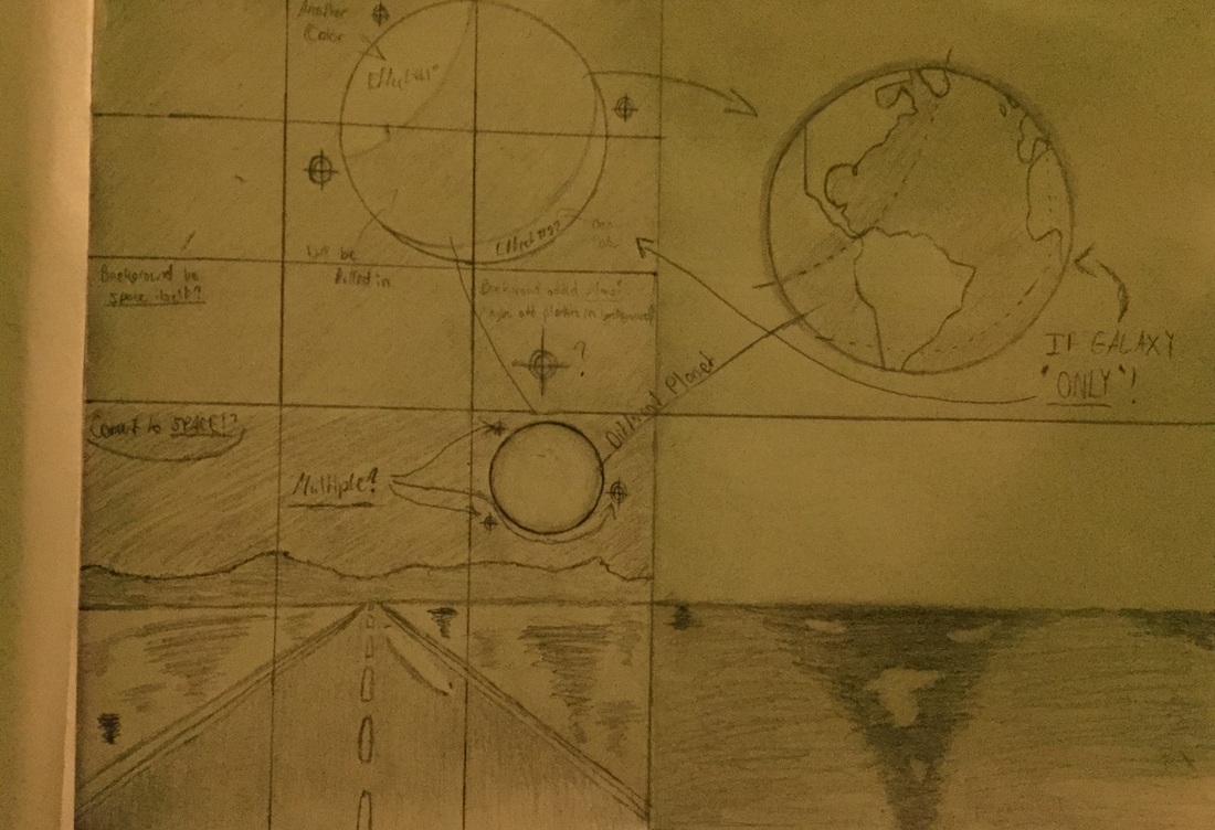
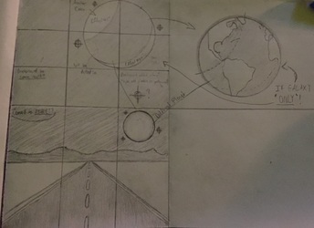
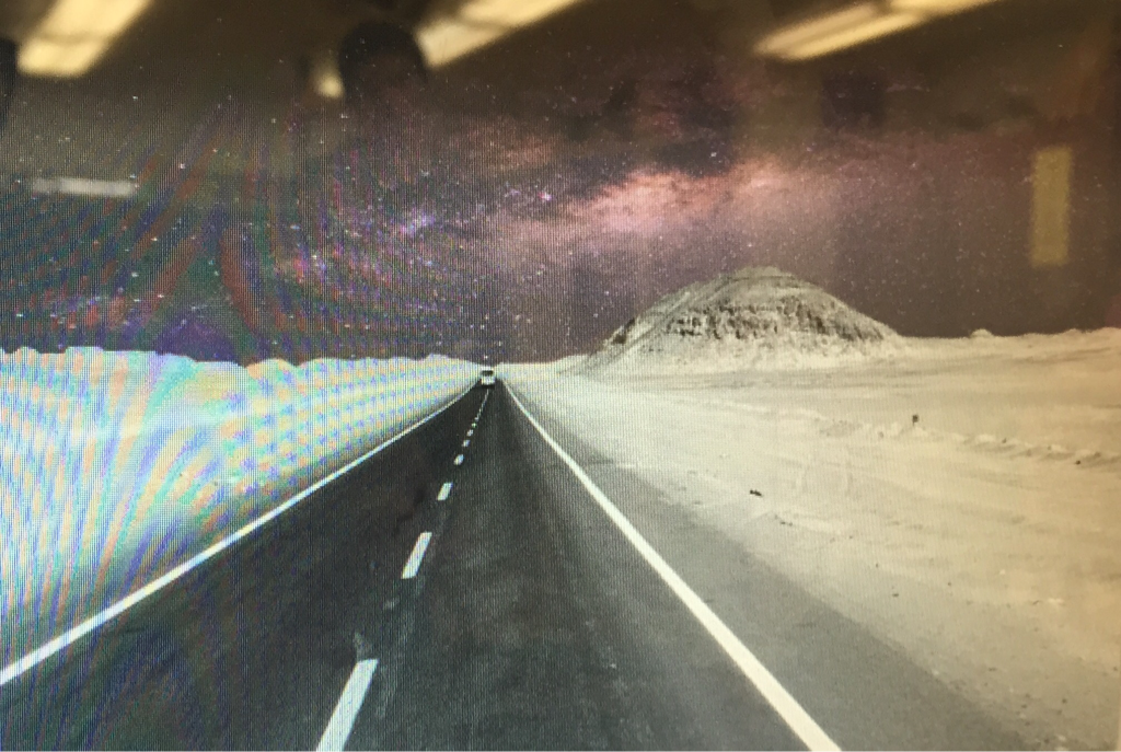
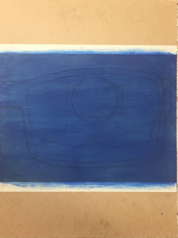
I completed the other background and decided if I was to give the image some type of fade that would give the image a purple or so type of "mist".
While I had the image, I was trying to mess with the filters that I was able to put on the photos. I just wanted to see if any of them would catch my attention, and this one did but I might not leave it like this. It all depends on the final piece.
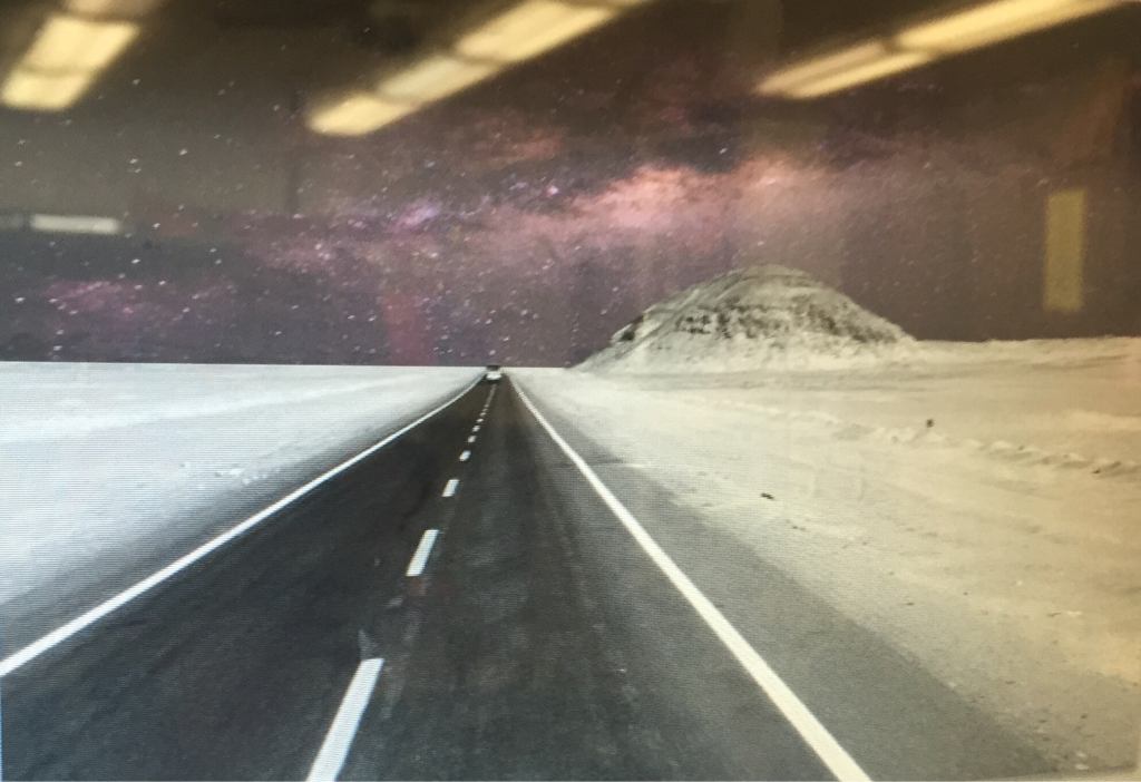
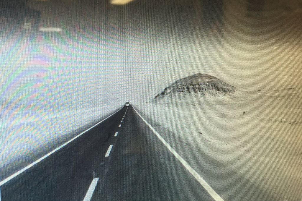
I tried to make the background look a bit more realistic by cutting out the little hills/mountains that are in the background.
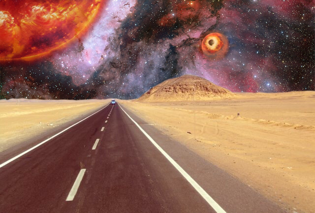
Quite a bit has happened between week #2 of working on the project up till the final piece. By looking at the image you can tell that the background looks different than the last and that a sun and another planet were added, with some little details added onto that planet. I also ended up changing the setting's filter back to normal instead of black and white, in my opinion I thought that image by itself looked a bit better than the one with black and white. I really like the way this project ended up being. When I had finished this project, I was doubting if whether or not I wanted to add more details because I felt as if this project wasn't really "completed" , but now I understand that if I was to add more detail the project would of ended up looking like if it had TOO much detail which could of ruined it.
|
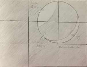
Then, after the first planet was sketched out, i decided to draw Earth just incase if my background wasn't going to take place in space. If I was to do Earth, the same effects would also be done to it.
Here I started to draw out another background just incase.
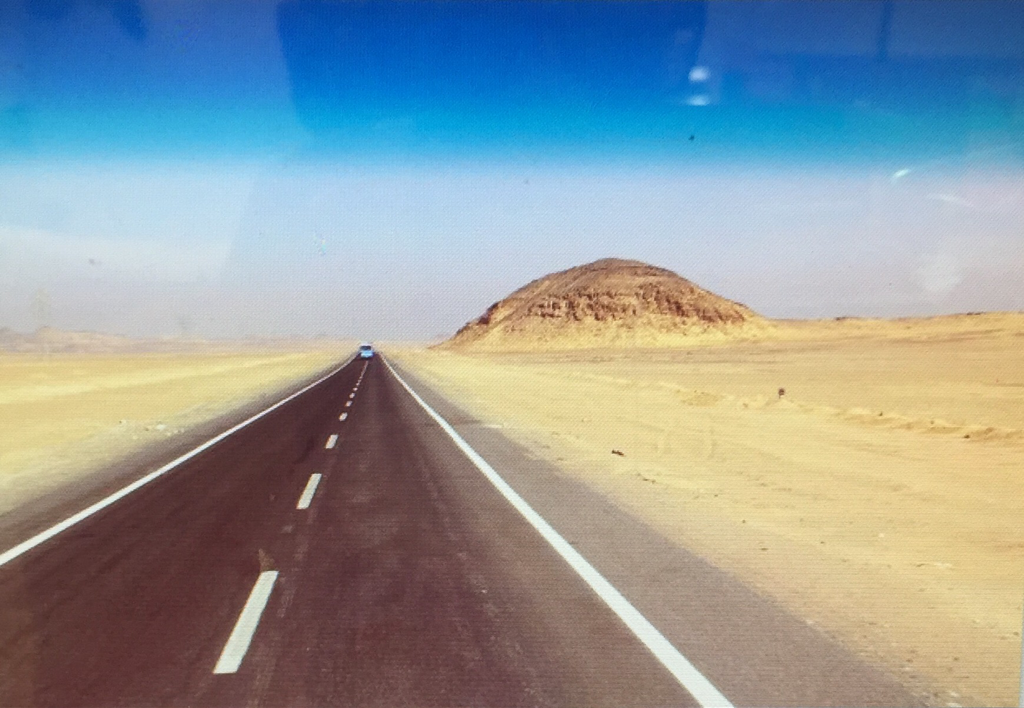
On the first day of the process I chose out what photo was going to be the photo I was going to work on.
After I was done messing with the filters, I placed on the other image to see what I had to do to make it look realistic.
At this part, I decided to add a little planet in the background. I'm still yet not sure if this planet is going to be my focus point or if I should add another one, closer and bigger, to maybe make it look a bit more realistic and also so I could have a better focus point.
|
|
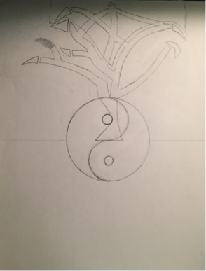
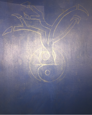
Before I began sketching for project #2, I was looking back at my other projects that I have done in the past. I thought it would of been a good idea if I was to try to combine both of those projects into one. The two projects that I tried to combine were my "One Big Puzzle" and "Yin & Yang". I began my sketch by placing a circle in the middle of the paper and making it the yin yang symbol. Before I attempted to draw out the tree I decided that I was going to split my image horizontally, like a reflection. From the inside of the yin yang, I drew the base of the tree and just made my way up. As you can tell by looking at the image to the left, I decided to leave this tree with sharp edges (supposed to represent the leaves).
|
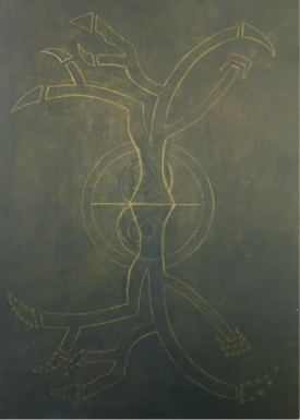
During the process of making this project, I decided that leaving in the yin yang symbol would make the piece a bit more difficult, so I had doubts on whether or not I should remove it, but in the end I did. At this point in the image I started reflecting the tree on the other side of the base. Another reason why I decided to remove the yin yang is because of the way the bases of the tree were turning out.
|
|
|
Here I am finally done with the drawing portion of it. As you can see, I changed the basses of the tree to a more simpler style instead of what I tried to do before. I drew the leaves on the other tree with circles just incase I wanted to try add them on when it was time to paint the whole thing.
|
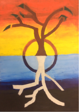
This is an image of the final piece. More information about this piece can be located in the "Protfolio" section in the tab
"Adv. Visual Studies Fall 2015". |
|
|
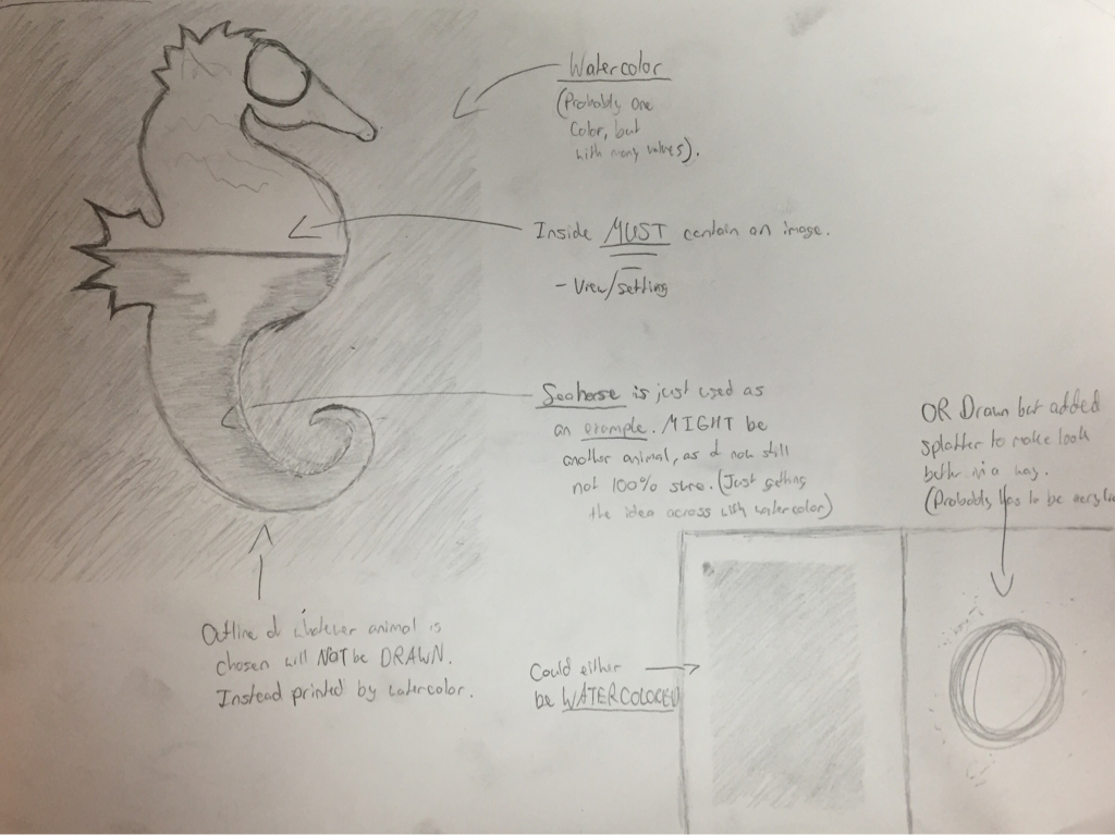
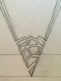
(J. #4) Project #3: BrainstormingFor this project, I was really trying to think of ideas that involve using materials that I haven't used yet, such as watercolor. Watercolor might not be what I end up using after I finished brainstorming, but I really want to try to get the idea across that I sketched out on my project. As you can see on the image to the left, the big sketch with the seahorse is the idea I would want to follow. Basically, I would want to draw an outline of any animal, for this example I chose a seahorse. After my outline would be drawn out, I would have to cut out that drawing from which ever type of paper I did it on. Then, place the cut out image on the paper that would be my final. After placed, I would rather choose one color or multiple colors that I would paint around the cut out seahorse, which would leave me my print in the end. In the animal, I would color in a view of my choosing. I really do feel like it's a good idea, but I could just do this with acrylic paint. If I was to do so then I wouldn't have to worry too much on how the watercolor spreads on the inside of the printed animal. If I do choose to continue using acrylic paint on this idea, instead of coloring around the image with one or multiple colors, I would like to see how it would be if I was to try to add a splatter effect on the canvas.
|
(J. #5) Project #3: Process
|
Before I started to draw out anything, I first had to think about what animal I was going to do my project over. In the end, I decided the animal I was going to choose was the California grizzly bear. To first start, I had to sketch out the outline of the bear onto drawing paper. After drawing the bear, I had to cut out the outline from the paper using an x-acto knife. Then I placed the paper that had the cut on it on top of the watercolor paper. From there I sketched the bear onto the watercolor paper by using the cut out drawing paper. After my bear was done being outlined, I started to use rubber cement. The purpose of the rubber cement is so that when I begin using watercolor, I only watercolor what's on the onside of the bear, leaving a negative space when done. As of now, I still have to begin my watercolor. In the end, I should have to watercolor pieces that are watercolored differently. One with the negative space, the other with the opposite.
|
|
|
|
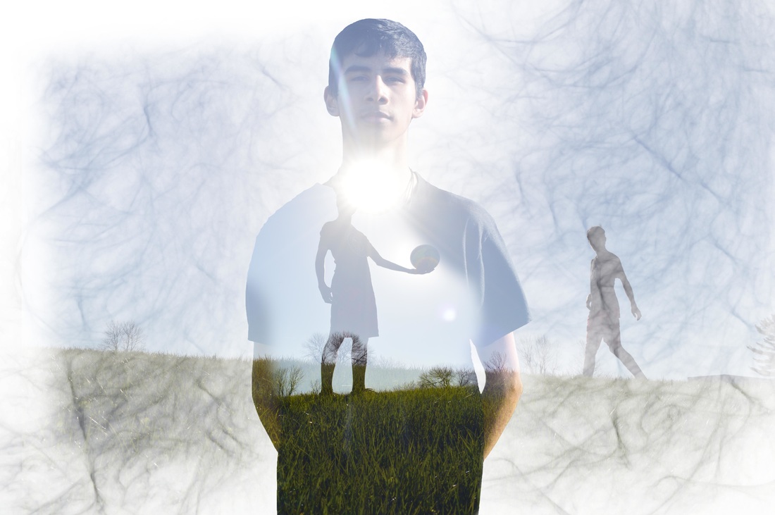
(J. #6) Project #4: ProcessWhen I first started brainstorming for this project, I really wanted to try to move this project back to photoshop instead of painting again. In order for me to come up with a better idea I decided to practice on photoshop with photography, of my friends, since that's what I wanted to work with. On my first practice, I worked with a photo of my friend Alex (the image that contains a white colored background). On his image I decided to crop him out and make him sort of pixelated, sort of like if he's fading away. In my opinion, after not working with photoshop for a while, it turned out quite nice. On my second practice, I worked with a photo of my friend Martin. For his piece he had originally given me a meaning or an idea to work with. The idea involved "finding peace" as shown on the final image. Since I have completed two short practice, I now have more an idea of how I want my final piece for this project to look like.
|
(J. #7) Project #1 (Semester 2): ProcessSo far, I have been struggling trying to come up with an idea for this project. On the right I provided two images of the ideas I was trying to come up with. The first sketch is from an idea that my English teacher wanted for me and or possibly one of my friends to complete, so I tried sketching my idea. My English teacher talked about how she would love a piece that involved Grendel's arm (from the story Beowulf) involved with the idea of words surrounding the arm to create a piece in the end that contains both English and Grendel's arm, so the sketch provided only shows how I pictured a background would be and how the arm would look similar to, however I did not finish the sketch for certain reasons. The next sketch I provided shows one of my ideas that I had which shows a person on his knees (supposed to be in misery, still need to work on that more if I decide to continue this idea) releasing anger in front of a pool of water. In the pool of water I would like to add a cartoon of what is really coming out of him, whatever can reflect as an example of anger or possibly confusion. As of now, I have another idea of possibly making a painting of a portrait of someone's face, most likely myself, covered in many colors that still comes out good and not just a piece with a barf of colors.
|
|
|
|
This week, I was still struggling trying to decide what idea I was going to follow for this project. In the beginning of this week I thought I wanted to do a piece that involved some type of portrait, but after attempts of sketching I decided that,even though it would good practice, an idea involving a portrait for this project might not be a good thing for me to follow since I lost the will to continue that idea, so I decided to paint something else that would show my concentration even more. After trying to think of many different ideas, I decided since I was taking such a long time to paint some type of fantasy scenery by using the same idea as my very first project I took on photoshop. I think trying to show the same idea but in acrylic paint would be something fun and creative to make.
|

|
|
Here, I had already drawn the outlines of what I was going to paint. I had also added the the masking time at the bottom so I could get straight lines of paint for a sharper look when it's complete. A couple of days before that I had made a mistake on not applying a background color onto the picture so I had to mix a special type of gel to my paint in order for me to get the transparent effect onto it so I can see the lines. As of now, I believe the piece I coming out well. I have already chose the colors that I need to use for this piece, and I think it will turn out great in the long run. Well, if I take my time while painting that is. I just need to work more on my blending skills. |
|
|
|
Recently, I feel as if my brainstorming hasn't been that great. Not because I'm not trying or anything, but instead, because of how much homework I've been having lately. Instead of focusing on art all I can really focus on is how much work I have to do. I know it might sound as a poor excuse, but I'm pretty sure this, at one point, happens to a lot of students. Eventually it'll go away, and my thinking process can go back to how it was. Anyways, for this piece I really want to try to somewhat make a piece that'll be similar to the work of the recent artist I did a response on. I couldn't really think of much ideas on what to work on, so the best I could think of was, to perhaps, make a design. Just a design that'll follow my concentration, but at the same time, turn out amazing. It still something I have to think more about. For now, I have a couple more things that I could add onto this. (I might end up painting this piece since I want to get a galaxy feeling across it).
|
|
|
I've decided that I wanted to continue on another idea because the idea that I had before was kind of confusing since I wasn't sure how I was actually going to make it. Instead, I would like to make another photography project with the help of photoshop. For the meantime, I've had a friend of mine, Alex, pose for random pictures which could possibly help me develop more ideas, you never know. The concentration for all of these will still be the same (fantasy), but I would like to spend a lot of time on these. After 2 or 3 practices, I will begin the actual project(s).
|
|
Before I started to work on the final products, I had been doing a lot of editing for senior pictures for me and my friends. Doing so, felt like if it threw me off from the mindset of making art that followed my "dreamscape" theme. Because of this, I decided to try to make whatever it is I was going to make contain less details and contain more color enhancements. I felt like doing so would be way easier and make it look simple, which could be a good thing. In the end, I made two pieces. One containing an outline of colors creating an image, and the other being a little more serious piece focusing on the enhancement of color.
|
|
|
For the past week or so, I've been editing a lot of photos for me and my friends. Most of these photos were senior photos for the yearbook or for our graduation photo slideshow. Since I have been editing for some time now, I really do feel like my knowledge on how to use photoshop is increasing. Right now I'm at the point where instead of clicking on the tools I already know what keys some of them are. I also know how some of the filters are created or how the curves of the colors can be altered to make the image look better.
|
|
For my next idea, I originally wanted to do a project involving photography. Based of off how things are going for me school-wise, I'm not sure if this will still be the case because I don't want to end up overthinking this idea when I don't have to. If I still decide to continue this idea, I would use either one or two of these photos. In the photo(s), I would either somehow add fantasy so it could match my original concentration, or I would somehow add more edits that make the photo more serious for his passion of the sport. If I don't decide to continue this idea, I am thinking of just making a piece that are similar to my earlier works of photoshop.
|
|
So far I have started three different pieces with the same idea. The only piece that has gotten my somewhere is the one posted above (left on most of the layers so you can see what is going on). The other pieces were just some that felt like they were missing multiple things, but it was too hard to tell what exactly those missing things were. Instead of waisting more time on those pieces, I simply deleted them and started a new one. For this current piece, I'm still deciding if I should change the curve of the colors, the position of the main image, and possible adding even more minor details. One thing that I could definitely say about this idea is that it's sure been a interesting one to mess with.
